|
|
|
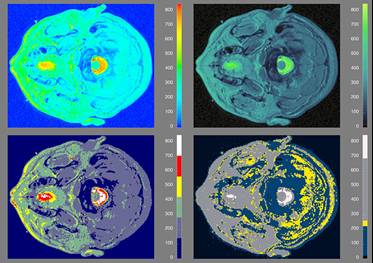
Figure
8. MRI Data with Rainbow, Isomorphic, Segmented and Highlighting Colormaps.
|
|
In
Figure 8, we revisit the MRI data shown in the second row of Figures 2 and
6. Again, the rainbow colormap in the upper left of Figure 8 creates
perceived contours which do not reflect discrete transitions in the
data. Structures in the data which fall within one of these artificial
bands are not represented, and attention is drawn to the yellow areas because
they are the brightest, not because they are in any way the most important.
|
|
|
|
The
isomorphic colormap (upper right) is designed to produce a faithful
representation of the structure in the data. A different isomorphic
colormap from the one employed in Figure 6 is used. It has greater
variation in hue, although still dominated by variation in luminance, in
order to show the structure of lower spatial frequency features (e.g., a
tumor near the center of the image).
|
|
|
|
The
segmented colormap (lower left) is designed to delineate regions
visually. Given the higher spatial frequency of the MRI data compared
to the pollution data, fewer segments are employed so that they can be
perceptually discerned.
|
|
|
|
The
highlighting colormap (lower right) is designed to draw the users' attention
to regions in the image which have certain characteristic features, such as a
tumor (lower right). This colormap was designed to draw attention to areas
which have data values near the median of the range.
|