|
1
|
|
|
2
|
- Benjamin Disraeli: "There are three kinds of lies: lies, damn lies,
and statistics." [phrase popularized by Mark Twain]
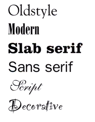
- How to Lie with Charts, Gerald Jones, iUniverse, 2000 [title inspired by
How to Lie With Statistics
by Darrell Huff, Irving Geis]
- http://www-personal.umich.edu/~mejn/election/
|
|
3
|
- History
- Design today
- Design guidelines
|
|
4
|
- “Of or pertaining to drawing or painting. graphic arts: the fine arts of
drawing, painting, engraving, etching, etc.; also, the techniques of
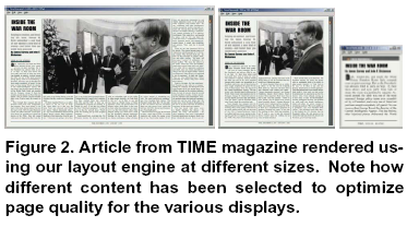
production and design involved in printing and publishing; graphic
design: graphics (sense B. 2 below); so graphic designer.” OED
- I.e., historically, chiefly 2D visual work, often involving printing.
Now includes photo, digital, etc.
- Taught chiefly in art schools or as vocational track in liberal arts
schools, but boundaries shifting and blurring
|
|
5
|
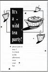
- Design deals with the display of information
- Words
- Diagrams
- Graphs
- Charts
- Etc.
- Good visual design complements other types of content and helps deliver
a message that is understood by the recipient
|
|
6
|
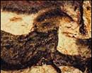
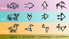
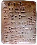
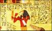
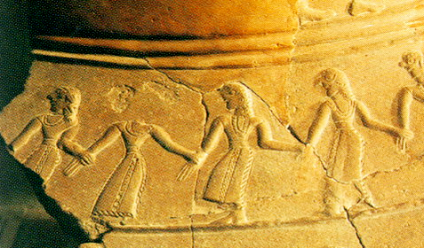
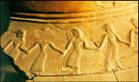
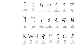
- 35,000 – 4000BC Cave paintings
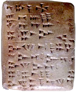
- 2000sBC: first writing systems (“visual counterpart of speech”) p4HGD
- Pictographs
- Cuneiform
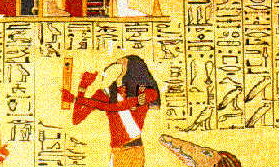
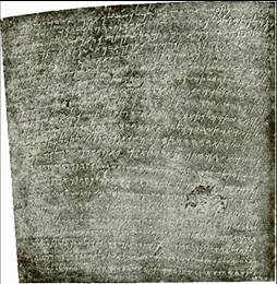
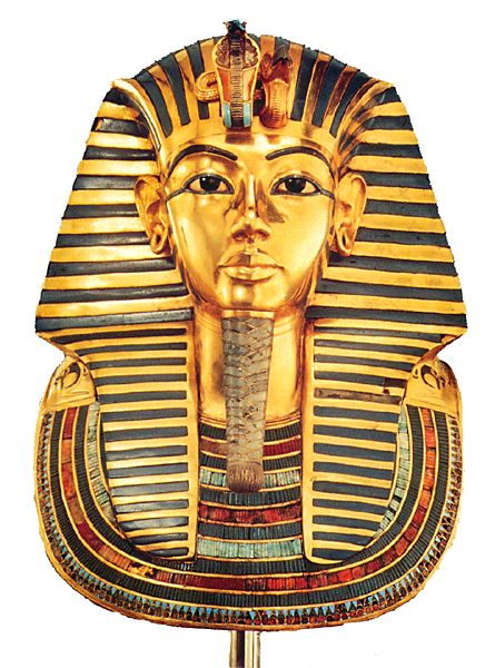
- Beginnings of hieroglyphics
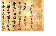
- 1000sBC: Egyptians create first illustrated manuscripts—combining images
and writing
|
|
7
|
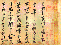
- Chinese calligraphy (~1800BC): used today by more people than any other
visual language system
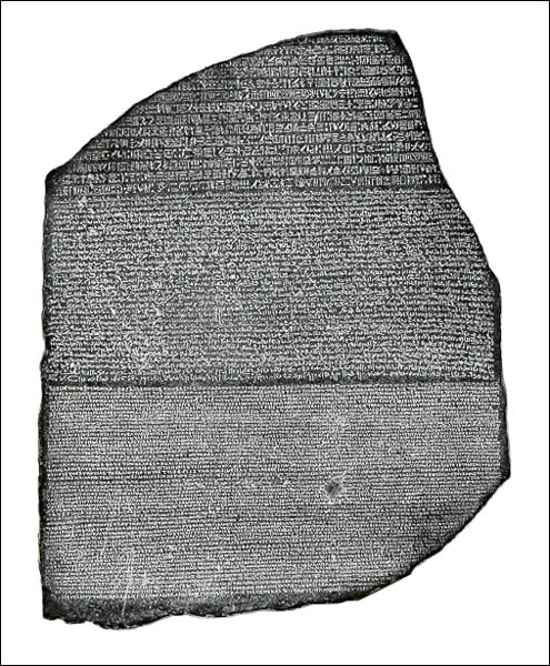
- Chinese invented printing: (3rd c BC-3rd c AD)
seals and wood block prints
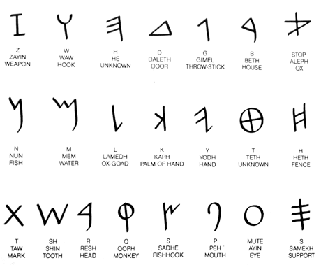
- Phoenician alphabets of only 22 abstract characters in use by 1500BC.
(Aramaic alphabets spread eastward)
|
|
8
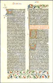
|
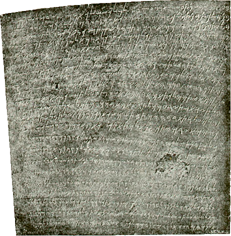
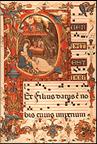
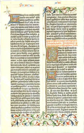
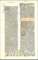
- Illuminated manuscripts from early 5th c AD
- initial caps, ornamental designs, illustrations
- using technology of paper making
- Codex (book) vs. scroll, from 1AD+
- Celtic manuscripts (600s AD) spacing between words!
- 6th-10th c: lower case letters developed
- Printing: Moveable metal type (Gutenberg’s press, 1450)
|
|
9
|
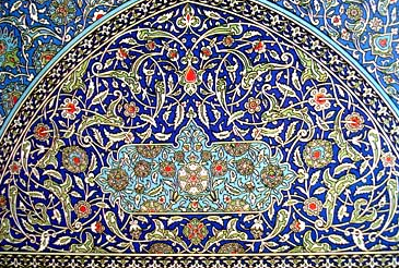
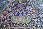
- 1100-1300s: Gothic, heavy type based on handwriting of the times
- Islamic manuscripts and science without peer in pre-Renaissance world
- Aldus Manutius, humanist and scholar (1450-1515), established printing
press in Venice. Invented model for Garamond, protoype for 2 centuries
European typographic design [p.90].
- Also first to bring out an italic type
- Company “Aldus” created Freehand, bought by Macromedia in late 1990s
(also Pagemaker, bought by Adobe)
- Claude Garamond (early 1500s). High-quality Roman type faces, first
typography independent of any one printer.
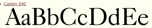
- William Caslon, England, early 1700s (for 60 years nearly everything
printed in England used Caslon fonts, refinement of Garamand’s)
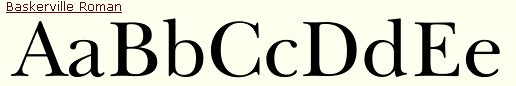
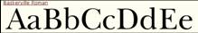
- John Baskerville (1700s). Early 1800s
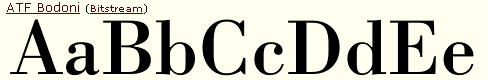
- Giambattista Bodoni, 1790 , press in Rome. Very thin serifs, letters
from small number of shapes—interchangeable parts.
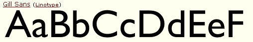
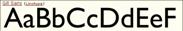
- Modern fonts like Gil Sans are often “sans-serif” (without serifs) and
feature strong verticals
|
|
10
|
- Rene Descartes early 1600s): x- and y-axes, Cartesian coordinates,
repeated axes= Cartesian grid
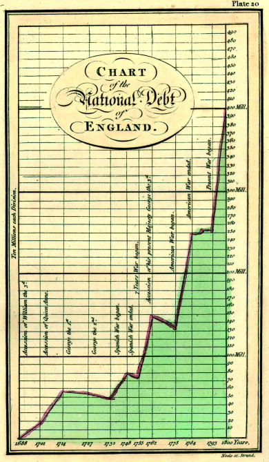
- William Playfair(1759-1823): invented line chart, bar chart, and pie
chart
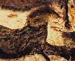
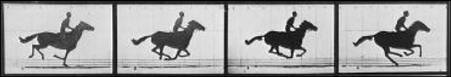
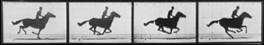
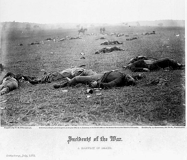
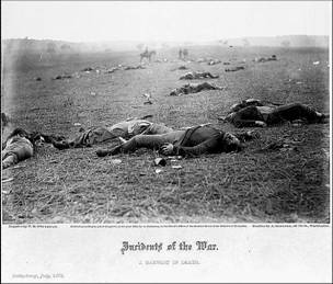
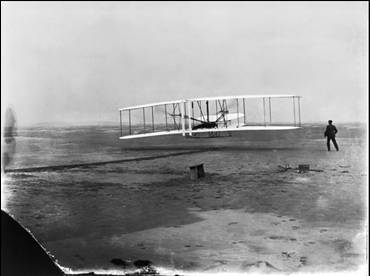
- Edward Muybridge—scientific photography (horse pictures 1877-78)
- Tufte: The Visual Display of Quantitative Information, 1983 (2nd
edition 2001)
|
|
11
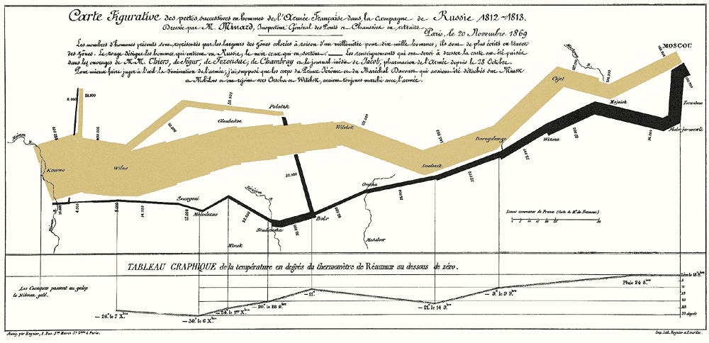
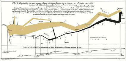
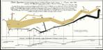
|
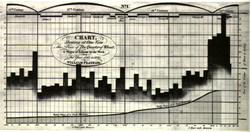
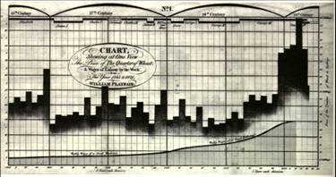
- Width of band indicates # of soldiers
- Plots size of army (width of band), location (on 2D map), direction of
travel, and temperature on selected dates
|
|
12
|
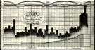
- Price of wheat, time (16th,17th, 18th
centuries) and reigns of British kings and queens.
- Line along bottom shows price of labor—and how wheat has never been so
cheap compared with that price
|
|
13
|
|
|
14
|
|
|
15
|
|
|
16
|
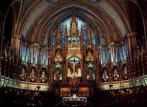
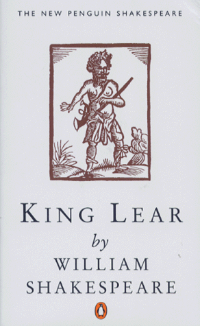
- Before we said: “Any version of
King Lear has the same information (vs. a copy of a Rembrandt or a small
image of a Rembrandt in an art test book)”
- Well, not completely true
- There *is* a difference between versions of King Lear:
- Typesetting
- Folio size
- Date of creation
- Medium (quill pen, laser printer, off-set press, etc.)
- Differences in visual aspects (vs. hearing it read, for example)
|
|
17
|
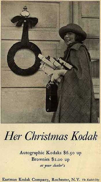
- Industrial revolution: billboard, posters, advertising
- Led to new type faces, mixing of fonts
- High-speed printing
- 1810 400 pages/hr vs 250 by hand
- 1815—2,500 pages/hr
- 1827 NYT @4000pages/hr
- Keyboard operated typesetting (linotype) by Mergenthaler.
[HGD p133]
- 1886 first demonstrated in NYT office
- Printing less expensive
- Color
|
|
18
|
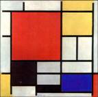
- Influence of modern art
- Swiss and Netherlands: geometric forms, grids underlying design
decisions [HGD p.225]
- Other -isms
|
|
19
|
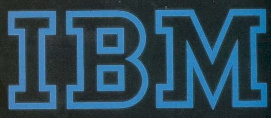
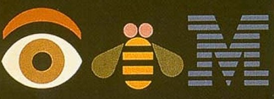
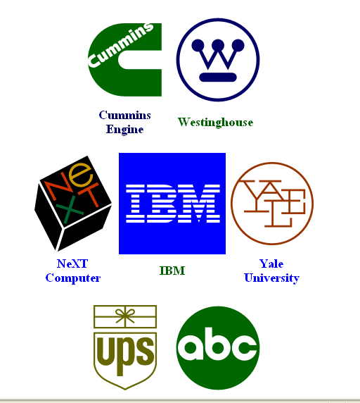
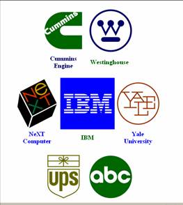
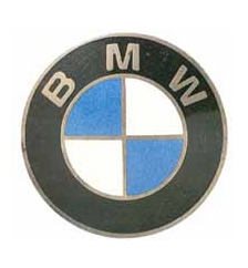
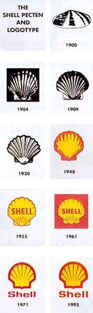
- Paul Rand (1914-1996),
- and corporate identity
|
|
20
|
|
|
21
|
|
|
22
|
|
|
23
|
|
|
24
|
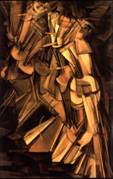
- Digital graphics: e.g., April Greiman
- David Carson, b. 1956
- broke rules: no grid,
- no contrast
- odd cropping
- reverse leading (lines overlapping)
- columns with no gutter
- unusual widths, etc.
- (think WIRED).
- Ever-changing MTV logo colors
- Explosion of typefaces, Web, interactive text, Multimedia
|
|
25
|
- Some style rules perceptually based, deal with legibility
- Tall skinny columns easier to read then very broad ones
- Size of type etc.
- Capitals, spacing between words
- Modern book design (Aldus, Baskerville)
- Some “rules” based on cultural trends, like fashion
- Type for different media
- Micosoft researching screen-readable fonts. Use with lcd panels, PDAs,
cell phones-- sub-pixel positioning. Word “reading” format
|
|
26
|
- Style, look
- Can be automatically produced …
- Salesin auto-layout paper http://grail.cs.washington.edu/pub/abstracts.html#AdaptiveLayout
|
|
27
|
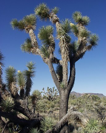
- She reads about the Joshua tree and thinks they don’t exist in
California.
- Steps outside and sees them everywhere
- “Once you can name a thing, you’re conscious of it. You have the power,
you are in control.” p14
|
|
28
|
- Contrast
- Avoid the “merely similar”
- Repetition
- Repeat visual elements throughout yr piece
- Alignment
- Nothing placed arbitrarily—each elements related to others through
alignment
- Proximity
- Related items close together
- Type
|
|
29
|
- We saw with perception lecture and drawing exercises that 2D lines and
areas of dark and light can convincingly evoke 3D space
- Same perception rules can be applied to type design and graphic design
in general
|
|
30
|
- Rule 4 “Interpret elements nearby in an image as nearby in 3D.” [Hoffman,
p.32]
- If all your text is hanging in space, where in space is it?
- Think of text blocks as objects
- Put related ones near to each other to have each become a part of
larger object.
- If non-related text blocks are near each other, the layout is fighting
the meaning… like parts of objects that don’t combine to make a
meaningful whole
|
|
31
|
- Things near each other pass signifieds back and forth more easily than
things that are farther apart
|
|
32
|
|
|
33
|
- “If two visual structures have a non-accidental relationship, group them
and assign them to a common origin.” [Hoffman 1998 p.60]
|
|
34
|
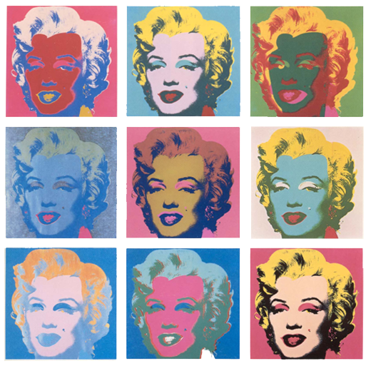
- Consistency
- Long history in design
- Unites elements, pages, etc.
- Can be a color palette
- Ecological? Many environments have repeating elements, textures
|
|
35
|
- Relative scale
- Framing
- Perception—how they created a sense of space
- Figure-ground
- Depth perception
- Hierarchy of viewing/reception of info
|
|
36
|
- Scale
- Value
- Line thickness
- Colors
- Shapes
- Spaces
|
|
37
|
|
|
38
|
|
|
39
|
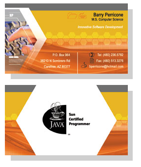
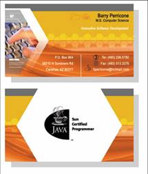
- We’ll be looking at business cards in more depth later—and making some.
- Type: pay attention to different type as you read books, advertisements,
and other written material
- First, the computer science side of “graphics”…
|

 Notes
Notes