|
The Bauhaus, a progressive art school in Germany that sought to redefine art education, is the major source of development in color theory. There, master Johannes Itten and one of his students, Joseph Albers began a indepth study of color theory. These Pages explore the fundamental color theory ideas and exercises that they developed. |
 Color is constantly changing. Color is always being
seen in relation to the colors it surrounded by. It is almost
impossible to see a color by itself and not interacting with its
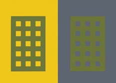
sorroundings. For instance the green in the following diagram appears
as two very different shades of green even though both of the squares
are the same shade of green. The green is interacting with the
backgrounds it has been placed on. The reason the green appears so
different on each background is that each color influences the green
differently. The following exercises will help demonstrate how color
is decieving and susceptible to its surroundings.
Color is constantly changing. Color is always being
seen in relation to the colors it surrounded by. It is almost
impossible to see a color by itself and not interacting with its
sorroundings. For instance the green in the following diagram appears
as two very different shades of green even though both of the squares
are the same shade of green. The green is interacting with the
backgrounds it has been placed on. The reason the green appears so
different on each background is that each color influences the green
differently. The following exercises will help demonstrate how color
is decieving and susceptible to its surroundings.
Color is understood through experience. We need to train our eyes to understand color and begin to see the differences between colors. Through comparison and contrast of different colors one begins to understand how colors interact and how to apply this to color usage.
![]() The picture to the left, originally made
by Josef Albers is a great
example of how color is decieving. We need to train our eyes to
understand what is happening. It is color interacting. The picture
looks like four different colored squares with a transparent folded
square on top of them. The transparency is actually just different
blocks of color that are just slightly different then their
sorroundings, placed on top of the squares. Ultimately you have to
remember that color is absolute and that it is always relative to its
sorroundings.
The picture to the left, originally made
by Josef Albers is a great
example of how color is decieving. We need to train our eyes to
understand what is happening. It is color interacting. The picture
looks like four different colored squares with a transparent folded
square on top of them. The transparency is actually just different
blocks of color that are just slightly different then their
sorroundings, placed on top of the squares. Ultimately you have to
remember that color is absolute and that it is always relative to its
sorroundings.

|
Goethe's Triangle applet | Alber's Plate 1 |

|